If you approach one print-on-demand (POD) shop, they might tell you "we do our text at 600dpi [dots per inch] and our covers at 300." The next one might say their covers are 600dpi with 200dpi interior halftones. The next one might take pride in saying they use 170-lpi (lines per inch) line screens on covers and 85-lpi line screens on grayscales. It might seem to be best to go with the shop that gives you the highest number, but someone who promises 170-lpi covers and 85-lpi text might end up giving you sharper output than someone who promises 600dpi covers and 600dpi text. What's all this DPI and LPI stuff? Confused? So were we. Keep reading . . .
How do interior images work?
If a POD printer asks you to submit 300dpi grayscale images from which they can make halftones, it does not mean that output is going to be 300dpi, or that the 256 shades of gray you see in each pixel of your computer screen are going to show up in the output. In fact, there are no shades of gray in the interior of a book; gray is simulated with black dots of different sizes.
Let's say that you want to produce the following common square inch of image in the interior of a POD book. You are probably viewing about 72 dots per inch vertically and horizontally on your monitor, which means that a square inch at the print shop (assuming 600dpi) is going to be bigger than 6 inches square on your screen. This is big for your eyes' sake. Throughout the rest of this page, every square graphic you see will represent one blown-up square inch.
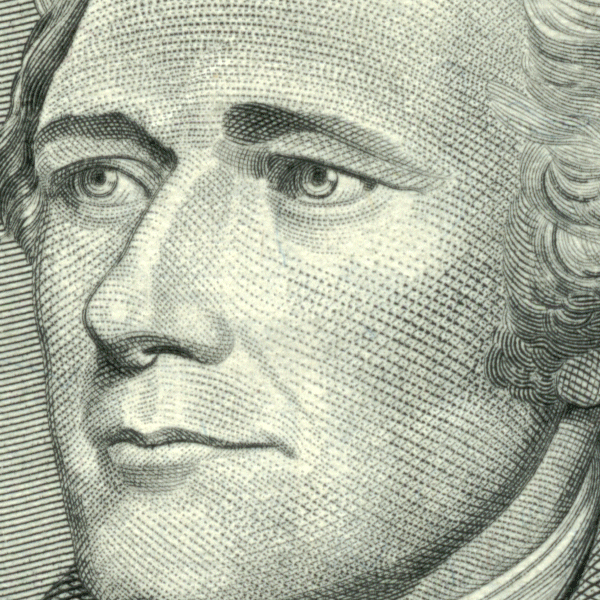
The starting image of President Hamilton's face has hundreds of colors in it. We need to reduce it to just two, black and white, for book production. Strictly black and white images (no gray) are also called "1-bit" images, because every pixel in the grid can be represented by a "bit" on a computer; that is, either a 1 (white dot) or a 0 (black dot).
On a computer screen, the ideal way to reduce the image to two colors is to apply a diffusion algorithm to it, making it look like this:

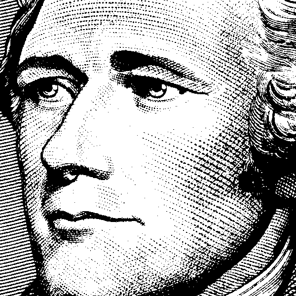
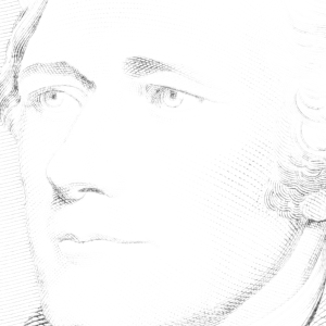
Unfortunately, a high-speed printer cannot pause to render dots so precisely and if you send them this they'll grind a weird-looking grid onto it and be frustrated with you for gumming up their process with exceedingly slow-printing images. They need to be able to sweep over an image and render it quickly and broadly by creating a few hundred dots or shapes per square inch, not a few thousand. You can do this either by reducing the image to line art (like a wood cut) using a computer effect like this:
Or you can present a grayscale image that will be made into a halftone at the commercial printery.
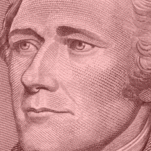
To make a halftone, publishers and printers usually start with a grayscale image. Grayscale images are made up of black, white, and a few hundred shades of gray in between. Each pixel of the image falls somewhere on a "gray scale." Here's Hamilton's face as a grayscale image:

A POD printing system "thinks" about a grayscale image by imposing a diagonal grid over the image. For illustration's sake, the grid is represented below in red. Each square on the grid is 4 pixels tall (1/150th of an inch) by 4 pixels wide, and at a 45 degree angle to the pixel rows and columns. If you were to connect every east corner with every west corner of each diamond and make a bunch of horizontal lines that way, you'd end up with 106 horizontal lines per 600 pixels, or a 106-lpi line screen. If instead of setting the grid at little 4x4 pixel diamonds you set it at little 5x5 pixel diamonds, your lines would be 85 lines per 600 pixels, or 85-lpi line screen.
The printing system then picks the average shade of gray in each diamond. That's not precisely what happens, but it is close enough for us to understand. It then draws a black dot in the middle of each diamond that is big or small depending on that average shade of gray, creating a halftone. Here's the result of a 106-lpi line screen over the 600dpi halftone:
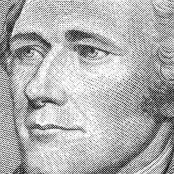
There are only two colors in this image now, and the dots are not so exactly placed that the printer would have to pause a long time to create them. Since the grid we used was once every 4 pixels, the effective resolution of this image is 150dpi (600 divided into a 4x4 grid, turned 45-degrees) and the effective gray simulation is 16 shades of gray. 16 shades of gray are everything from no dot (white) to a small dot (medium gray) to a solid fill-in of the grid diamond (black). If you back a few feet away from your screen, you'll see what the average reader sees when this is just one square inch on the page: the optical illusion of shades of gray on President Hamilton's face.
Here is what the halftone looks like if we make a grid 5x5 pixels instead of 4x4:

In this version of the halftone, we have an 85-lpi line screen, an effective resolution of 120dpi and 25 possible shades of gray (sizes of dot) in every diamond. Some POD printers like to use 106-lpi because it shows more details and shows outlines better, and some POD printers like to use 85-lpi line screens because they simulate more shades of gray and show gradients and 3D shapes a little better.
So why do they ask me for 200dpi, 240dpi, or 300dpi gray scale images instead of 120 or 150?
Usually, a print shop will ask you to finish grayscale images in your document at a higher dpi than the effective resolution. In some ways, this is simply deceiving; they're just trying to get bragging rights over each other by saying "we do 600" while the other one is saying "we do 200." But in some ways, overshooting grayscale resolution is good. If you have areas of your image that have a lot of high-contrast detail resembling line art, sending a 200-300dpi image will aid the "grid" thinking of the computer slightly when it renders the dots. Generally, it is good to submit images to your print shop that follow their specifications precisely, but know what you're getting: you're getting a much lower effective resolution than they're asking for and many fewer shades of gray than the 256 colors you're sending them.
Why don't they just ask me for 600dpi grayscale images?
To save space and time. A good halftone can result from a 300dpi image because the "grid" finds the average color within each diamond when determining how big a dot to draw. In a 600dpi image with a 106-lpi line screen, the computer finds the average color among 16 different dots in the diamond shape (4x4 pixels). If you send a 300dpi image, the computer finds the average color among 4 different dots (2x2 pixels) in the diamond shape but it's almost always the exact same "average" color that it would find averaging 16 dots. Remember that although you have 256 shades of gray per dot in your computer grayscale image, the "grid" is only going to guess with a sensitivity of 16 (for 106-lpi or 25 for 85-lpi) shades of gray. Or think of it this way: if you were to send a 600dpi halftone, you'd be sending 16x256=4096 pieces of information in each grid diamond to a process that needs to make a choice with a precision of 1x16=16. That's overkill (256 times more information than they need), and 4x256=1024 pieces of information (still 64 times more information than they need) is usually more than adequate to produce the halftone. More than double the effective resolution in your original is not going to result in a better halftone.
Can I just do the halftone reduction myself?
That's generally a bad idea. Your image editor may have a "halftone" command, but print shops have determined the best halftone algorithms for their machinery. You might not see this, but they might even print half your books on one set of machines with one set of "best" halftone algorithms and another with another machine and another set of halftone specs. The publisher should create nice sharp grayscale images with good contrast, texture and focus, and the printer should create the halftones on-the-fly while printing.
How about if the POD shop has 1200dpi output?
If the output is 1200dpi instead of 600dpi (or any other number of DPI, for that matter), it is not going to change the effective resolution of halftones. The effective resolution is always going to be the line screen times the square root of 2 (approximately 1.414). If someone asks you for 300dpi images at a 1200dpi shop and does a 106 line screen, it will still give you an effective resolution of 150dpi. The difference is that instead of 16 shades of gray (4x4 diamond), they will be able to simulate 64 shades of gray with each dot (8x8 diamond). This will give you cleaner halftones with rounder dots. 1200dpi output printers can raise the line screen higher than 106 with good results, too, because it can simulate many shades of gray on more precise grids. But 300dpi grayscale images are still perfectly adequate for 1200dpi output.
Okay, explain POD color!
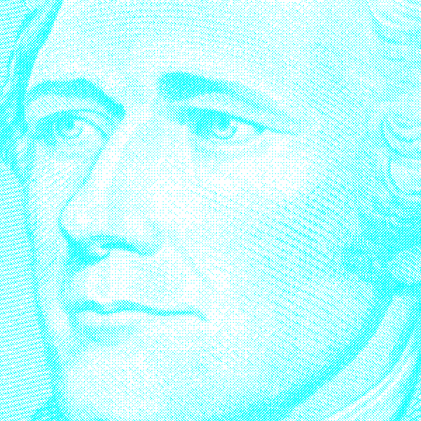
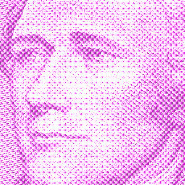
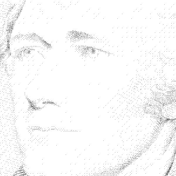
Now that you understand better how halftones are made from grayscale images, it's not terribly difficult to explain color. Color printers for POD covers and interiors usually print in 600dpi also. Some print shops will say "we do 600dpi" and you'll send them a 600dpi image and they'll turn around and say "that file is too big, send 300dpi", which is confusing. When you take President Hamilton to a color printer, he gets split into four "channels". These are a little bit like the red, green and blue controls on a television set, although combining them together in printing makes the combined colors darker rather than lighter as with light (monitors, televisions, etc.). Four color channels will be made from the image, and each will be made into its own halftone dots. Different printers use a wider variety of different dot strategies for color output than for black and white halftones, but here's a common strategy. Split the image into four color channels, cyan, magenta, yellow, and black or "CYMK" (the letter "B" is reserved for "blue" in color abbreviations, so black is "K").

Each of these color channels is then made into a halftone. Since there are going to be more dots of different combined colors moving around, it is normal to increase the line screen to around 170-lpi and thus the effective resolution to 240dpi. Halftones of each of these channels look like this:

When you combine all of these together so that they darken one another "additively," you end up with an image that looks like this:
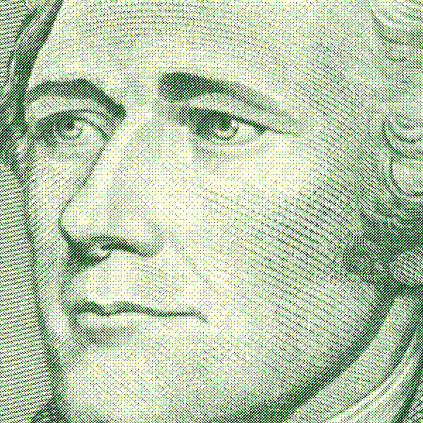
With an effective resolution of approximately 240dpi (170 times the square root of 2) or so through the color channel halftones, 300dpi color images on covers are more than adequate; 600dpi would be overkill again, even though the individual little dots in those 4 basic colors are coming out on a 600x600 grid.
An exception to this rule is if you have an area of your cover that is in only one of the CMYK colors over a white background. In that situation, you'd have the equivalent of "line art" on the cover, and you'd want to have 600dpi output. A barcode (black "K" only) over a white background is a good example of this. In those places, 300dpi is not as sharp as 600dpi would be. With a barcode, nobody really cares (who praises pretty barcodes?; choppy is fine) but if you are going to do your cover as black text over a white background, you'll get funny results at 300dpi. White covers with black text are generally unprofessional looking anyway, so this is not that significant an exception or problem.
Why does this last image look less like money than the one at the top of the page?
The U.S. Mint is not stupid; they understand that complex color and shading and complex lines in the same image make it impossible to reproduce perfectly. Also, your computer screen can show about 16.7 million colors per pixel at 72 pixels per inch, and light shines out of it. The printer renders about 1,600 color combinations per pixel at 240-600 dots per inch and light is absorbed by and reflects off its output. These are what we call two completely different color modes or "gamuts." Neither looks exactly like money, but both convey the image adequately. One (monitor) is like a television picture of money, and one (print) is like a mosaic mural wall representation of money. Neither will look just like the original, but that's not the point; the point is to make a nice, crisp, representative cover that makes sense in context.
Thanks for reading this page. We hope it helped shed some light on the oft-confusing issue of halftone production in books.